EZPick Mobile App
(Academic, 3 week sprint)
Samuel Ho
Matthew Kwok
Henry Wang
Farnaz Niazi
Research
UI Design
Branding Design
Interactive Design
Miro
Invision
Figma
Adobe Illustrator
Adobe Fresco
I remember on numerous occasions where I had no clue what to do once I arrived at a vendor's parking lot to pick up my online orders. I never knew what I was getting myself into until I reach the designated parking spot and spend some time reading the instruction on the sign. Some vendors want you to text the number on the sign. Others want you to check your email for instructions. Some may even ask you to wait in the car until someone physically shows up.
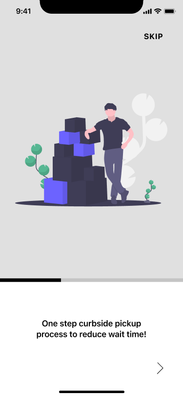
EZPick was designed to eliminate the uncertainty within the curbside pick up system in its infant stages and improve the efficiency of users picking up their purchases.

Before we started researching, we made some assumptions to enable ourselves to conduct interviews and survey. Drawing from experiences, we assumed that customers picking up their orders have an unnecessary amount of uncertainty. We also felt that there was a lack of consistent process from one vendor to the next. We were extremely confident that curbside pick up was here to stay, and that there was potential for improvements and marketing purposes.
We needed to find out what actual users think about the curbside pick up process. By conducting user interviews and gathering survey data based on a proto-persona that we established, we were able to reinforce our assumptions and focus on some key points.

1) Wait times are often too long.
2) Lack of communication between vendor and customers.
3) Order confirmations are often confusing.
4) "Check-in" process is all over the place.
5) At least 60% are iPhone users. (survey results)
During this time, we also discovered through competitor analysis that there were no direct competitors. A similar service available was "Route", an online order consolidation app that let's you check the status of your deliveries all in one place. We saw the convenience of "Route" and kept in mind about how we want to solve our problem drawing from a design like "Route".
The curbside pick up process is often unclear and time consuming. This often results in customers feeling frustrated. There's an opportunity to make the pick up process more clear and efficient, in turn improving customer satification ratings and order turnaround time.
We asked ourselves some "how might we" questions based on our data and problem statement to get the brain juices flowing.
1) How might we improve clarity for our users?
2) How might we reduce the time necessary to complete the curbside pick up process?
3) How might we allow vendors to be more transparent about the process with their customers?
Answering to these HMW questions, we were able to explore features that we could potentially implement to help our users with their curbside pick up.

We utilized a feature prioritization matrix to determine what we wanted to implement as the MVP of our design.
As we discussed and voted on what we determined to be the MVP of our design, we settled on four main features starting from the iOS platform.
1) Being able to confirm the product before employees extract from the warehouse.
2) Being able to see an estimated wait time.
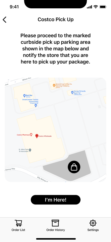
3) Being able to locate the curbside pick up designated parking area.
4) Being able to contact all vendors for pick up using this tool.
To materialize our concept, we constructed a user flow to give ourselves more direction to begin sketching wireframes.

User flow from onboarding to completing a curbside pick up order.
By constructing and iterating our user flow, we saw the foundation built for our product. There are a few checkpoints where we felt were key to the success of our app.
1) Sign up details: allows vendors to identify user's vehicle.
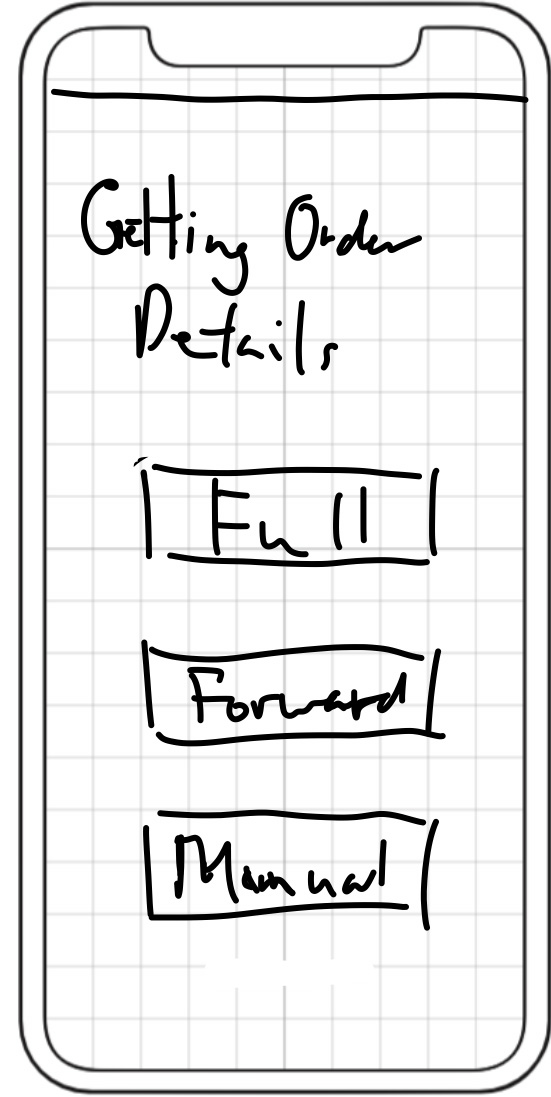
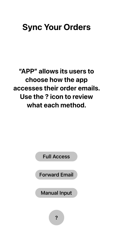
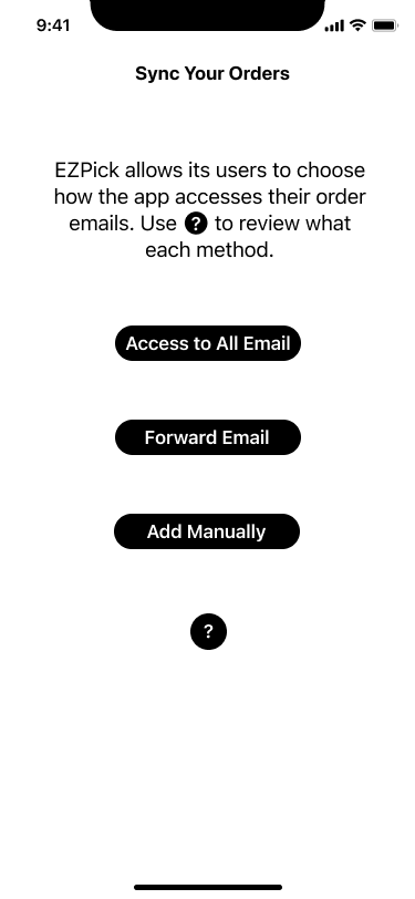
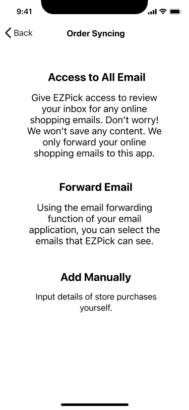
2) Method to acquire order details: users give permission for the app to sync online order emails in your email account.
3) Interacting with pick up button: users notify vendors by interacting with this button.
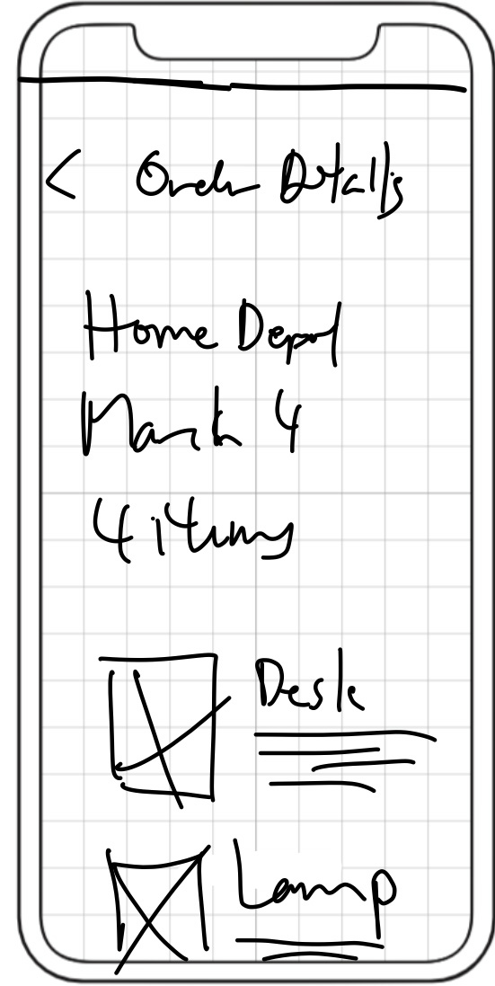
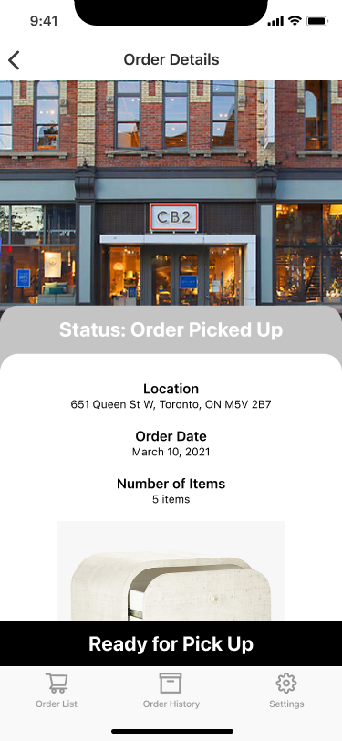
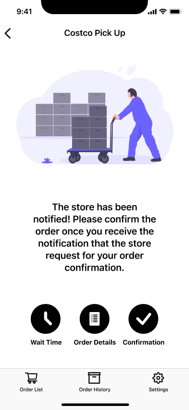
4) Order confirmation: users confirm if the product being retrieved matches their order.


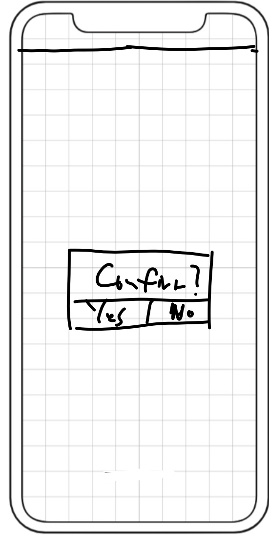
Set of sketches our team decided to proceed with.
We felt that the sketches were very standard but lacks clarity of what the app did. In order to conduct user tests, we needed to prioritize clarity and structure by digitizing the design.


Low fidelity prototype used for our first round of user testing.
We got together with several curbside pick up users to monitor how they interacted with our product. We had the users imagine if they had to pick up an order using our app. While the users ultimately completed the process, they had trouble or concerns along the way.
1) Privacy concerns regarding location access to shopping information.
2) Process to pickup a package was not clear.
3) Unclear language and iconography: pick up status and for confirming the package you are picking up.
4) Process to verify a package is confusing: request photo seems unnecessary.
The results of the user tests gave us invaluable insights to progress into the next stage of our prototype. To tackle these issues we decided to make adjustments to the way we implemented certain features or interaction.
1) We revised the tool tip wording to better convey the instructions for each order syncing method.
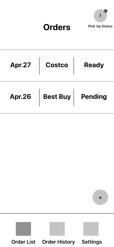
2) The "Pick Up Status" button was converted to a "Ready to Pick Up" button that appears as the user arrive.
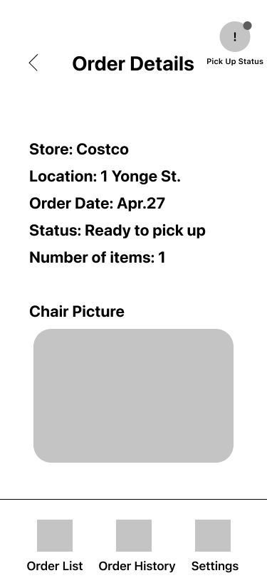
3) Removed "Confirmation Picture" interactive image and revamped the pick up details layout.
4) Revised the way users confirm orders. Assuming vendors scan barcodes when retrieving orders, we could use this "input" to relay to EZPick for confirmation.
Mid fidelity prototype after applying adjustments based on user test insights.
Our mid fidelity prototype produced great results. Most of our users got through the process with no issues, with the exception that they felt there were some contrast issues with cards on the order list screen. This was later solved by developing a brand that was appropriate for our product.
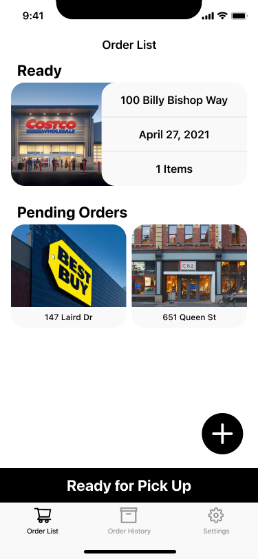
Our final design for EZPick was very simplistic in terms of the functionality of the product. By staying MVP-driven throughout the development process, we were able to refine a lot of the interactions to present a better experience to our users.
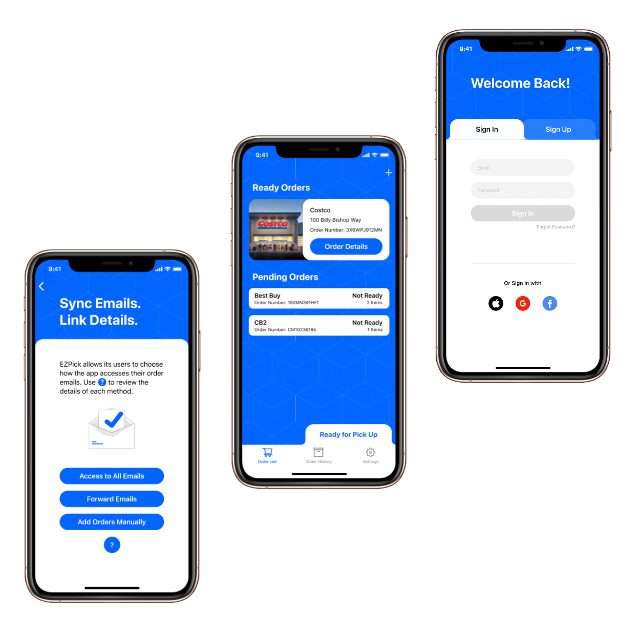
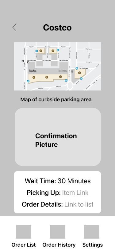
Your vehicle information is now stored on your EZPick account. This enables the vendors to locate your vehicle more efficiently in the designated parking area.

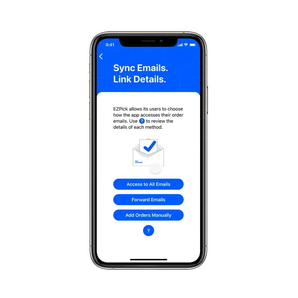
Users have the option sync online orders using the three methods available on EZPick.
Customers will no longer have to wait until they arrive at the designated parking spots to get instructions on how to contact the vendor. With EZPick, the process is always consistent and transparent.

Given the limited time we had to develop this design, I was proud of the outcome. I strongly believed in the potential of this app because of the imperfections in the curbside pick up system. By focusing on the MVP, we were able to truly design a simple, yet game-changing experience for curbside pick up users.
There were areas during and after the project where I wish we could do more to solidify the concept, such as understanding how vendors retrieve an order from the warehouse for curbside pick up customers. We also felt that we could improve the app by having a live update after confirming the order for better clarity.


