Gyu Kyou

Branding Design
Duration: 4 weeks
Completion: Nov 2022
Overview
Gyu Kyou is a high-end Japanese barbeque restaurant looking to develop a brand that is coherent with a pre-established interior design concept.

Background

Before the project started, Gyu Kyou approached me with an existing interior design concept heavily influenced by Japanese culture to develop a coherent brand with the decor.

As the branding designer of this project, I communicated with the interior designer to understand his vision for the decor. After the discussions, I delivered my brand concepts to the stakeholders to acquire feedback. 

Discovery

From the discussions with the interior designer and stakeholders, I learned that their design derived from the power and stance of a charging bull and renderings of the decor had a reminiscence of Japanese influence. Furthermore, I discovered that the name's literal translation meant “bull sound.” 

Objectives and Approach

From the feedback I received from the stakeholders, I listed a few criteria that should be considered for the brand to be cohesive with the interior design:

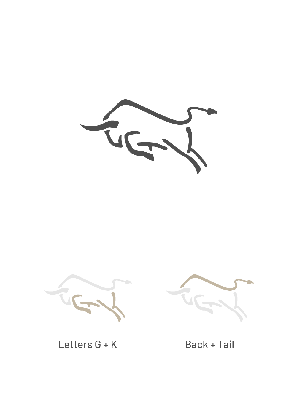
1) Connect to the food industry. The bull gives off an energetic and powerful vibe, consistent with Gyu Kyou’s mission statement to serve customers with impactful flavours. I seek to make a connection between brand recognition and the nature of the business.

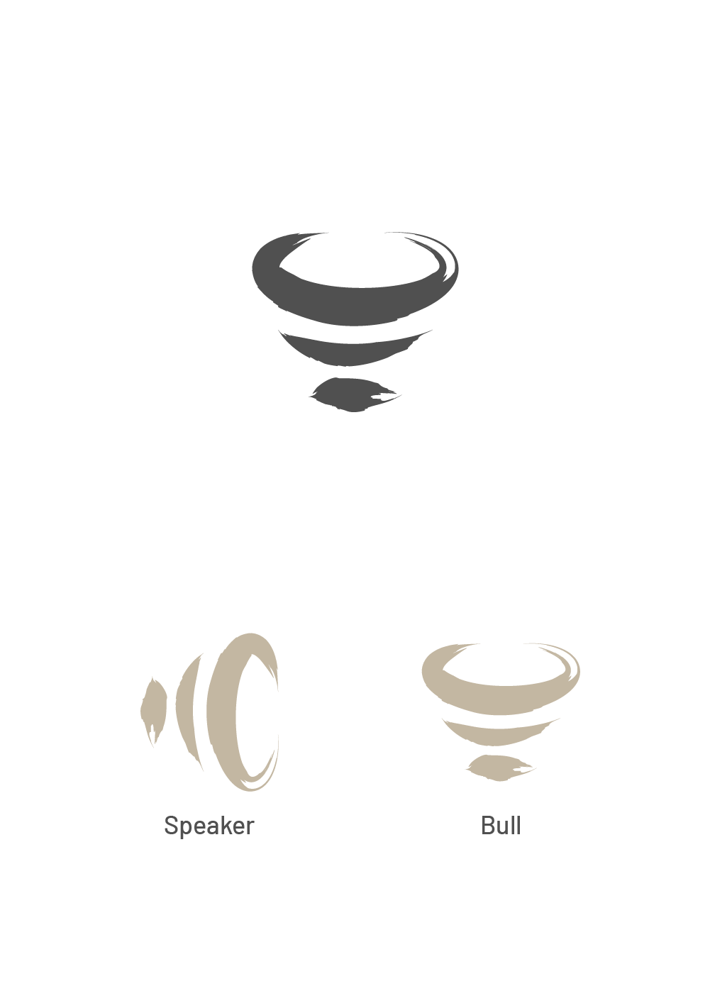
2) Japanese influence. To emphasize the Japanese influence, I opted to use traditional elements such as the Enso circle, brush strokes, earthy tones, etc., while keeping it as simplistic as possible to match the Japanese minimalism lifestyle.

3) Merging concrete and Abstract Elements Since the bull is a highly recognizable element with limited expressions of determination, I aimed to build a special brand recognition that integrated different elements to satisfy the target market's interest or preference.

Sketches

To begin the sketching phase, aside from the bull, I explored Gyu Kyou’s name and existing charging of bull elements at an abstract level. I broke it down into these themes: 

1) Sound: Represents the sizzling of the dishes, the applause voice, and restaurant livelihood 

2) Scent: Represents pleasant aromas from different food types. 

3) Force: Represents the impact of the taste from delicious food on taste buds.

4) Luxury: Represents the premium food.These abstract elements empowered me to come up with the following sketches.

Version 1

I selected several sketches to prepare 3 digital proposals to present different ideas with unique elements:
Option A
Highlight: The crest is a symbol for royalty and luxury. The smoke/aroma emitting from freshly made dishes forming a crest represents the premium food served by the restaurant. The letter "G" was also implemented to the head of the bull.

Feedback: While the crest did deliver the luxury/royal feeling, one stakeholder felt that smoke was a negative and sensitive subject, which might not be widely accepted by the target market. 
Option B
Highlight: A charging bull composed of short strokes containing the GK initials pertains to the impact of flavours and the minimalistic Japanese lifestyle.

Feedback: Overall quite pleased, but they were concerned that the aesthetics didn’t fit the decor. The same stakeholder believed that the stroke that formed the back and tail represented the downward trend of a business.
Option C
Highlight: A combination of a bull and a bell objectifies the livelihood of the restaurant and the customers. 

Feedback: While the concept was accepted, the stakeholders felt that the imagery could use some revision due to it looking like a pacifier or a lightbulb. 

Version 2

The stakeholders opted to revisit options B and C with a different approach. Per the feedback from the proposals, I summarized and analyzed the key considerations. By leveraging my experience and skillsets, I modified the designs and presented the following revisions to the two proposals.
Option B Version 2
Highlight: I adjusted the stroke forming the back and tail to imitate the Enso circle while keeping the head of a charging bull. The Enso circle is a symbol of Japanese influence that represents zen and perfection, which helps prevent the imagery of a downward-trending business.

Feedback: the stakeholders appreciated the spirit of the concept and were carefully considering this option as the final logo.

Option C Version 2
Highlight: Brush strokes were utilized to form the shape of the bull's head. This adjustment applied Japanese influence to the logo. To pertain to the sound theme, the form of a speaker replaced the bell in the previous proposal. This iteration also became more abstract and less recognizable as known objects.

Feedback: The stakeholders were satisfied with the added Japanese influence and the overall aesthetics of the logo. However, one of the stakeholders was concerned about the top-heavy logo, which could create a sense of instability.

Final Design

After careful consideration, the stakeholders and interior designer decided to proceed with option B as a baseline for the logo.
Fonts and combination mark variations were explored. An earthy, wood inspired colour palette was implemented to reflect the material chosen for the decor.

Takeaway

Key takeaways from this project are that:

1) Challenging process.
Since Gyu Kyou had already finalized their interior design prior to the development of the branding, it limited the directions in which the brand could be explored. I learned to break down pre-established concepts to an abstract level to enable the brainstorming phase, resulting in a solid branding.

2) Understanding a new subculture. I’ve grown to consider more aspects, such as feng shui and superstitions, during the design process when discussing learning about client demands. The iteration process could be more efficient by being more empathetic.