Besanz

Branding Design
Duration: 2 weeks
Completion: Dec 2022
Overview
Besanz is an upcoming business phone system that offers full customization for their commercial phone services and Customer Relationship Management. 

This project aimed to develop branding for Besanz to highlight its mission to provide a simple solution to connect businesses and their clients.

Background

Initially, Besanz only emphasized the development of their cloud-based software and had limited brand recognition. 

As the branding designer for this project, I communicated with the stakeholders to gather their feedback on how Besanz stands out from the crowd.

Discovery

During the discussions, I discovered that the stakeholders have a limited preference for the brand image. However, they stated that the brand should include the nature of the business and broadly accepted. They also believed that their target is startups due to the willingness to accept new products or services.

Objectives and Approach

I brainstormed what Besanz offers as a service based on the feedback I received from the stakeholders. I came up with three main criteria to be implemented for the brand:

1) Open-mindedness. Willing to accept new ideas and any new challenges as a startup. 

2) B2B and B2C. Build a stable and rigid relationship internally and externally. 

3) Recognizable imagery. Create a memorable icon by making an intuitive connection to the brand name.

Sketches

A list of elements was established to showcase Besanz as a service.
Here are some sketches that derived from the list of keywords:

Version 1

I selected two options that met the criteria listed above.
Option A
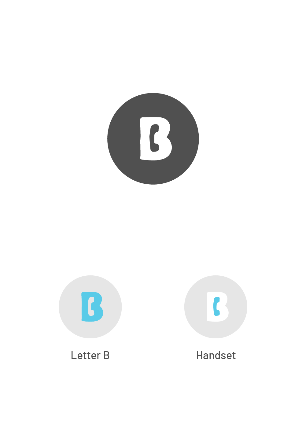
Highlight: A connection could be made to the name Besanz and the nature of the business by incorporating the handset into the B silhouette. Concrete representation like this logo is likely to increase brand recognition.

Feedback: The concept showcased the nature of the business. However, the traditional handset could limit the expandability of the business into the digital realm. This option also has a limited representation of internal and external communication.
Option B
Highlight: Circles are welcoming shapes and convey stability, collaboration and support. The rigid structure of the triangular layout could further reinforce the stability theme. As a result, the combination of circles and triangles represents Besanz's support for businesses and their clients. This abstract exploration allows room for imagination.

Feedback:
Stakeholders prefer the abstract concept because they want to keep an open mind to the possible aspects of expanding their business. However, the links between the three circles could not easily distinguish internal and external communications. 

Version 2

Following the stakeholders' feedback and their preference for the abstract concept, I modified my design based on option B. 

I bonded the two circles to represent the internal communications, whereas the third circle represented clients. I also rotated the triangular structure to imitate a play symbol representing advancement and progress.
I explored options for fonts to be utilized in the logo. Roboto, a modern, sans serif font, was utilized since the brand's target market is young startups. I also incorporated the linked circles and the standalone circle to the brand name for a more unified look.
Furthermore, I explored colour palettes for the brand.
The stakeholders approved the iterated version of the logo in conjunction with the text. However, the colour palettes with black being the primary colour made Besanz seem like a design or advertising agency instead. In agreement, we progressed to the final stage with the navy and cyan combination for a reliable yet youthful image.

Final Design

After careful consideration, the stakeholders and interior designer decided to proceed with the branding below:

Takeaway

Key takeaway from this project:

Engage stakeholders in discussions.
By asking open-ended questions, I collected and summarized stakeholders' preferences, considerations and passions, which guided me in the right direction.