EZPick, the curbside pickup hub.

User Research
Visual Design
Prototype
User Testing & Iterations
Duration: 3 weeks
Completed: May 2021
Academic
Overview
EZPick was designed to eliminate the uncertainty within the curbside pick-up system and improve the efficiency of users picking up their purchases.

As a team of 4 designers in a UX boot camp, we designed a solution to improve a merchandise pick-up process.

Background

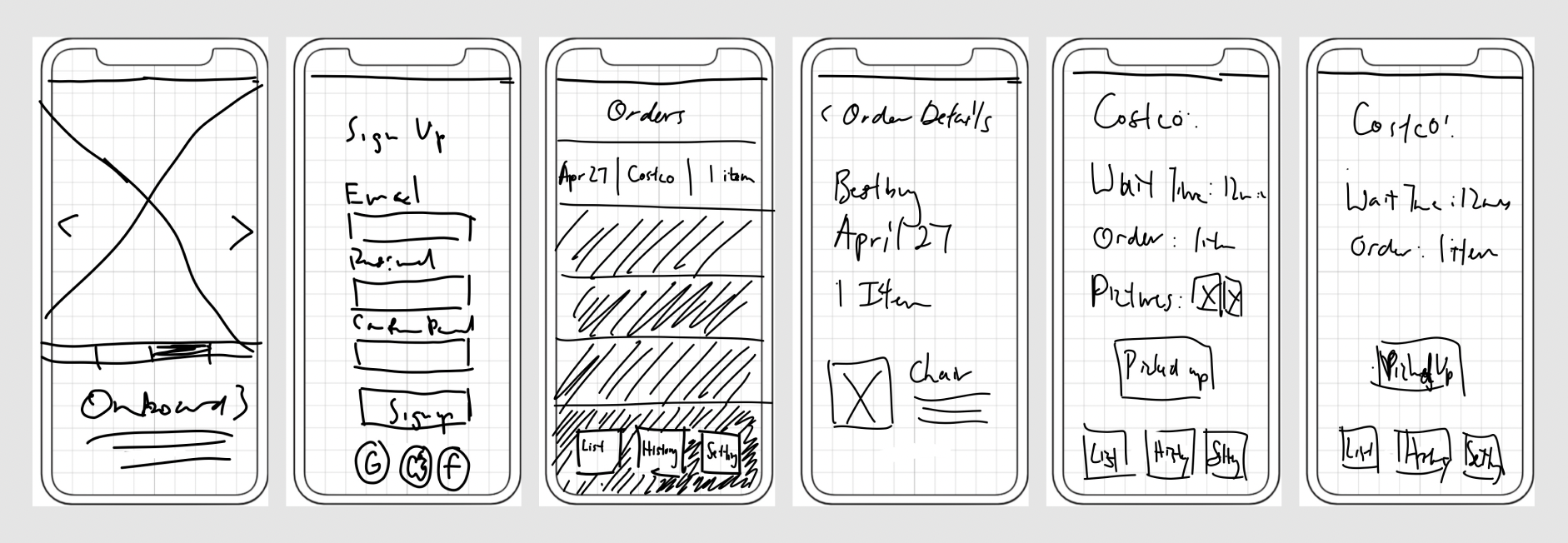
During the pandemic, the curbside pick-up process became a prominent part of the shopping experience due to the convenience of not having to shop in-person and contactless exchange. However, this process of picking up confused the users because of the inconsistent procedure among different vendors.

As 1 of the 4 designers on this project, I was mainly responsible for marketing and research strategy. In addition, I participated in multiple discussions with my team for prototyping,branding design, and presentation deck design.

Here are some of my key achievements for this project:

1) Being an effective communicator. The team dynamic enabled me to be an effective mediator in consolidating brainstorming ideas, integrating with my research and marketing skillsets to develop a strong foundation for the project.

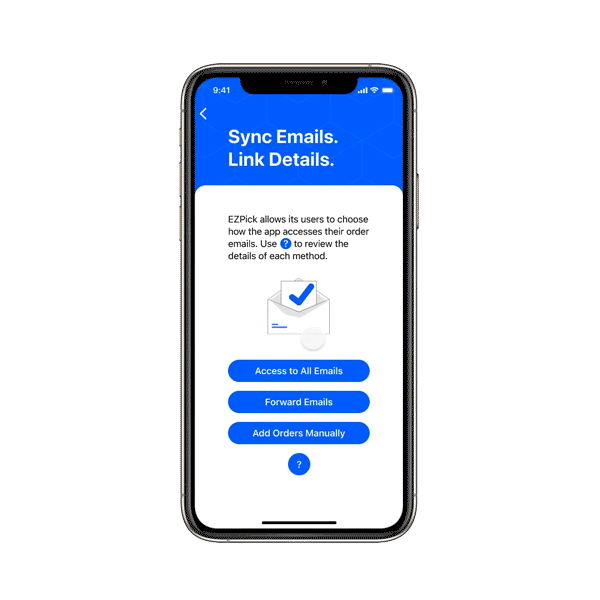
2) First prototype from a real world problem. By working on my first real-world case, I discovered idealized concepts were difficult to implement in the real world due to limitations, such as privacy concerns to allow complete access to email inboxes to acquire online order information, which may not be widely accepted by the end users. So we need to emphasize how to integrate theoretical ideas with reality.

Discovery

According to the results from 8+ interviewers and 30+ google surveys, we collected quantitative and qualitative feedback, which supported us in identifying the issue of the current curbside pickup system. We were able to reinforce our assumptions and focus on some key points.
Here are the insights we received:

1) Unexpected wait time. Wait times were often longer than expected. 

2) Risk of human error. 
Vendors can deliver the order incorrectly by utilizing the current curbside pick-up system.

3) Misunderstanding pick-up timing. 
A small portion of the data revealed that customers sometimes misread the confirmation emails as ready-for-pick-up emails because the email's format and layout are identical.

4) Inconsistency in the curbside pick-up process.
 The check-in process for curbside pick-up needs to be more consistent among different vendors to reduce confusion.  

5) Device preference. 
From the survey, at least 60% of the users preferred the iOS platform. We decided to prioritize focusing our design on the iPhone until the concept is mature to implement in the Android platform later.

Defining the Issue

Problem Statement:

Existing end users who appreciate their time find the existing procedure to need to be clearer and more efficient.

Objectives and Approach

By reviewing the insights we gathered through user research, there were crucial things that we needed to tackle (besides making it look aesthetically pleasing) for the procedure to be successful:
1) Adding checkpoints for confirmation. Prior to delivering orders to the curbside pick-up zone, clients should be able to confirm the items to save time for both parties involved.

2) Wait time predictability. After arriving at the curbside pick-up zones, clients should know how long to wait to receive their items.

3) Centralized hub for pick-up. 
Integrating order details from all vendors makes it convenient for end users to track all order information without locating an abundance of emails. Using a centralized hub would improve the clarity and efficiency of the user experience.
To materialize our concept, we constructed a user flow diagram to give ourselves more direction to begin sketching wireframes.

Prototype, Test, and Iterate

Based on our objectives and approach, we sketched out some wireframes that followed our user flow diagram.
After careful internal testing and discussions, we agreed that the above sketches provided an intuitive experience we should apply to our digital prototypes. The solution should incorporate a simple navigation bar, a notification page, and a home screen that efficiently showcases all upcoming orders ready to be picked up.
We used our low-fidelity prototype to test curbside pick-up users to acquire some feedback ending with some concerns:

1) Privacy concerns regarding email access. Allowing our app access to sync with email inboxes for order confirmations raised concerns about their privacy. 

2) "Pick up status" button lacked clarity. 
The "pick up status" button was not easily distinguishable from a profile icon. Users also needed clarification about the effect of the button.

3) Unclear instructions.
 Users requested assistance clarifying unclear app instructions regarding features like location services, email sync, notifying vendors, etc.

We made adjustments to our prototype based on the feedback we received:

1) Email sync options added. 
Two additional options to sync order information were added to alleviate privacy concerns. We added an option to forward order emails based on rules set by the user in their email service provider. Another option we added to the app requires users to input each order manually.

2) New "Ready to Pick-Up" button. 
The "pick-up status" button was relabeled to "ready for pick-up" for a clear call to action. The button was also relocated to the bottom of the home screen to avoid resembling a profile icon.

3) Copywriting improved for precise instructions. 
The instructions were revised to convey their intended message to users. 
Our mid-fidelity prototype produced positive test results. Most of our users were comfortable going through the whole procedure. However, there could be improvements to the colour contrast of the user interface.

Final Design

We solved the colour contrast issue by incorporating branding colours. As a result, our final design for EZpick was functional, intuitive, and minimalistic. For Figma prototype, please click here.

Here are the highlights for our final design:

Takeaway

We emphasized the completion of the minimal viable product during the duration of the project, which restricted our exploration of some additional features.

Here are some potential features that could be implemented:

1) Update status as items get fulfilled. EZPick can aim to implement a feature that allows users to get updates about their orders as each item gets fulfilled.

2) Improving security. Email security and privacy concerns will continue to be a point of emphasis in delivering a pleasant user experience.

3) Map Support. We can incorporate a map service to expand our map database that indicates curbside pick-up zones.

4) Supporting small local businesses. For businesses without an established customer communication system, we can look for potential solutions to include them in our services.

5) Live updates. A live update screen resembling Uber's order processing page can be implemented to enable users to overview the pick-up process as it unfolds.